Website: http://www.emmahackartist.com.au/
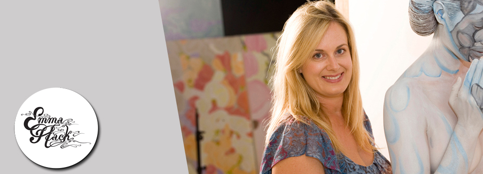
- Diverse Multimedia Artist
- Skin Illustrator, Sculptor nd Photographer
- Adelaide-based artist
- Ehibiting since 1999
EXQUISITE DESIGNS
-
Her photographic prints camouflage the human form within her designs
- “… a human form, a person, and/or an animal, is actually present in the work”
- Surely it's superimposed? Digitally added? Does the model really have to stand there the whole time?

“Blossom Butterfly” 2012
HOW DOES SHE DO IT?
- Emma began photographing these herself, evolving to a “multimedia art-form”
- She does not use stencils or projection —it is painted completely freehand.
- Firstly, she paints the wall. Lines up the camera, paints a line initially on the shoulder and then lines the body up with the wall painting, then continues looking through the lens
- The process can take between 8-12 hours
- Her work is not ‘Photoshopped’
- Hours of painting by hand and adjusting lighting to minimise shadows
- Seamless flow from body to design
Utopia
Collection

“Hydrangea
Cradled Owl” 2013
HOW SHE DOES IT:
COMMERCIAL
Gotye -
“Somebody That I Used To Know”
- Fame rose in 2012 when she collaborated with singers Wally de Backer and Kimbra

- Backdrop is a painting based on an 80’s piece of work by Gotye’s father Frank de Backer
- Emma saw her profile skyrocket worldwide with over 350 million hits on YouTube.
- The work “Body Crash” was created for South Australia's Motor Accident Commission, as part of a campaign to stop low-level speeding and help reduce the road toll
- Initially this image looks like a car crash, but when you look closely it’s actually formed from human bodies.
- The process included her and a small team painting the bodies of 17 men and women to be assembled into the wrecked car formation.
- The final result took 18 hours for the five layers of paint, the posing and photography shoot.

I appreciate this
photograph, not only because of it’s message but because of it’s creativity.
You can see the attention to detail and appreciate the form of the human
figure, the colours and the light and shadows used. I like it because it is
hard to comprehend the amount of hours and patience it would’ve taken to create
and complete.
Body Crash - Behind the Scenes
Commissioned
by Natura

Amazon
Forest - “I am
Forest”

River
Scene - “I am
River”
I am
interested in nature and landscape photography, so these images appeal to me
because they are a unique representation of this kind of photography subject.
I like the
artwork because it reflects the colours and the vibrancy of the forest and the
river. You can feel and see the connections between reality and natural forms,
but she has interpreted this in a way that she can express on the human form
and continue onto the canvas. There is a clear link between the colours,
textures and lighting of nature used in these two photographs.
WALLPAPER DESIGNS
Aside from
commercial designs, she is well known for her Wallpaper collections.
‘Signature
Prints’ (publishers of the Florence Broadhurst range), gave Emma full access to
the Broadhurst archives of over 530 designs, which began her Wallpaper
Collections from 2005 spanning to 2010. 

“Living
with Broadhurst”
Wallpaper
2008- 2010
These
collections linked models holding native birds creating ‘floating’ effect within
the designs, as well as the female ‘wallflowers’She then experimented with adding creatures to include her love for Australian animals and concern for the environment.
All
animals were tame and treated with kindness during the painting process.
Her collection Evolution, features native Australian fauna and
evokes the idea that ‘perhaps we are taking over their environment, and if so,
would they[animals] begin to camouflage within ours?’
(http://www.emmahackartist.com.au/emma_art/emma_evolution.html)

“Evolution Crocodile" from Evolution Collection
She also experimented with other types of designs, such as: employing the ‘mandala’or circle, as a visual representation of wholeness and patterns of life. For example her collection Native Mandala.

“Joey in
Kangaroo Paw” 2009 - Mixed
Media from Native Mandala
MY PERSONAL FAVOURITES:
Exotic
Mandala Collection

“Exotic
Bird” 2010
Emma
has camouflaged the human form into combined wallpaper designs, creating a
circular mandala collaged background into which her muse is artfully blended.
I like
this image because I appreciate how long it would take to align the mandala
through a camera lens and brush strokes. But I also admire the beauty and
representation of nature through the peacocks and butterflies in contrast with
the bold red. The artist’s intent of Exotic
Mandala is to capture “…the beauty of art nouveau inspired designs with
butterflies placed on her muse.”
(http://www.emmahackartist.com.au/emma_art/emma_exoticmandala.html)
Birds
of Prey Collection

“Owl in
Woods” 2011
This collection “revisits
Emma’s love and fascination of combining Australian birds within her artwork”
(http://www.emmahackartist.com.au/emma_art/emma_birdsofprey.html),
including: an owl (as shown), Wedge-tailed Eagle and Peregrine Falcon.
Blue and White Collection

“Holland”
2012
One of
Emma Hack's latest collections, ‘Blue and White’, features the fascinating
evolution of blue and white ceramics, which evolved throughout the trade from
Asia to Europe centuries ago. The
collection features 5 countries, China, England, France, Portugal and Holland
(shown). (http://www.emmahackartist.com.au/emma_art/emma_blueandwhite.html)
At first I
didn’t like really the collection, not because I didn’t appreciate the designs
or the effort but because it reminds me of vintage crockery and hoarding, but
as I began researching and looking at the artworks as a whole collection, in
more detail I found quirky features which symbolised the different countries,
such as the dragons or native flora to the country.
POP!
Collection

“Google
It” 2012
Her
collection Pop! links to Emma’s fascination with the pop art genre. A modern
day approach to comic inspired work of Roy Litchenstein, rather the women
are not helpless but strong women. There are
3 collections within this theme:
- 'The Optimists', looking at the positive side of life.
- 'Lessons of Love' features messages to get over that bad break-up.
- '.com' (a sample shown) is based on a social media theme, drawing the girls into todays social media culture.
Growing up
with comic books and in an ever-changing and evolving social media generation,
gave me insight into the artist’s intent and appreciation of this collection.
Also having been through bad break-ups, loss of friendships and life-changing
events, such as the loss of a loved one, these images were easy to relate to
and admire in context.
POP! Collection - Artist's Perspective
VIDEO: http://www.youtube.com/watch?v=2m1vbEv6q-M
TO SUM UP...
What I
like most about her work as a whole is that her subjects are subdued into the
artwork, into a place of imaginary or creativity, which we can all relate to.
The work reflects the beauty of the feminine spirit and immersing yourself in
your environment. The way she expresses her intentions and the representation
of and respect for nature is what I find most appealing about her work.
No comments:
Post a Comment