Exercise 6: Colour Correction
Find the White Balance of the image using the White Balance Tool.
Optimise the colour balance of the image using the Basic adjustments
(Vibrance, Saturation) and HSL Adjustments.
White Balance:
- Check the white balsnce to set the file up with as few colour problems as possible
- Think of it as a promotional image, make it as visually appealing, birght, vibrant, can’t look sickly, 'make those colours sing', watch out for your reds, blue skies
Histogram:
- Histogram can see a whole bunch of colours in different channels
- Exposure of image is sitting nicely in the midtones
- Higher the peek, higher exposure
- Read it left to right: tells you where shadows (l) and highlights (h) are
- Brighter is when it goes to the right, blow highlights or block shadows to the right
- Data is evenly exposed in image, sets you up for success, you can edit it for promotional purposes (solid)
White point (third tool in from left)
- Highly reflective materials have white bits in them, as light bounces off them colour turns to white, but they can also be coloured (blues and greys running through them), glass and chrome in cool spectrum
- Look for something that’s supposed to be white in real life (sample a pixel from the number plate)
Using: Road Train.NEF
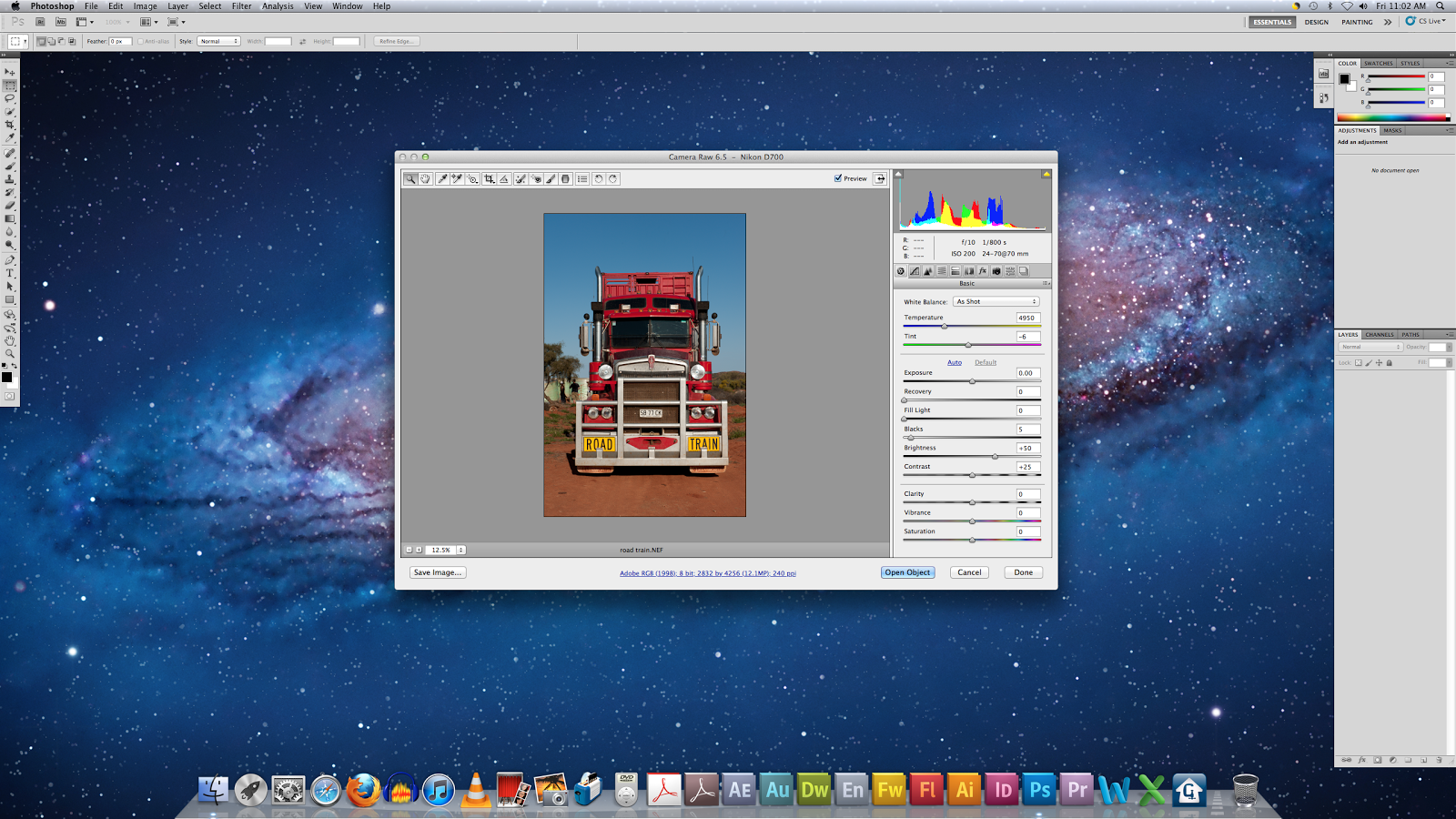

Using the White Balance Tool:


Adjusting Hue and Saturation:


Final Image Submission:

I think finding the white balance first made a huge difference to this image! I should remember to use it in all my photographs I think because it makes the image look more realistic and clean. This exercise was handy to do because I could see how far you can take certain odours in an image before you over or under saturate them! I think my colours may be too bright, but I won't know until I submit.
No comments:
Post a Comment